Campaign, Print, Digital
The importance of rethinking
Brunswick cybersecurity
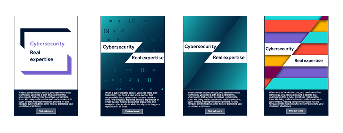
Brunswick is a global advisory firm specializing in business-critical issues. They help clients navigate the interconnected financial, political, and social worlds to build trusted relationships with their stakeholders. Brunswick approached Merchant Cantos for a campaign to advertise their expertise in cybersecurity. I was brought in mid-way through the project after it had stalled.
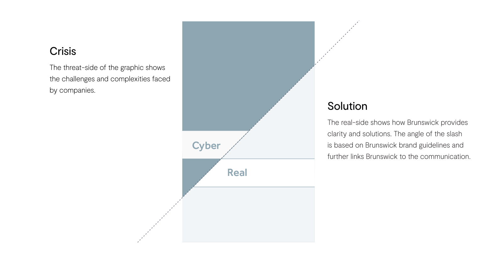
Brunswick's brand guidelines mandate the kind of diagonal division you see below, and I was asked to design to include this visual treatment.
Redefine and Rethink
It quickly became clear that the project had stalled because the design thinking wasn't clear enough. Together with the Creative Director, I rethought the design approach. I conceptualized the diagonal line as the border between Crisis and Solution: Brunswick's own brand graphics contained the problem and the solution.
Keep it simple
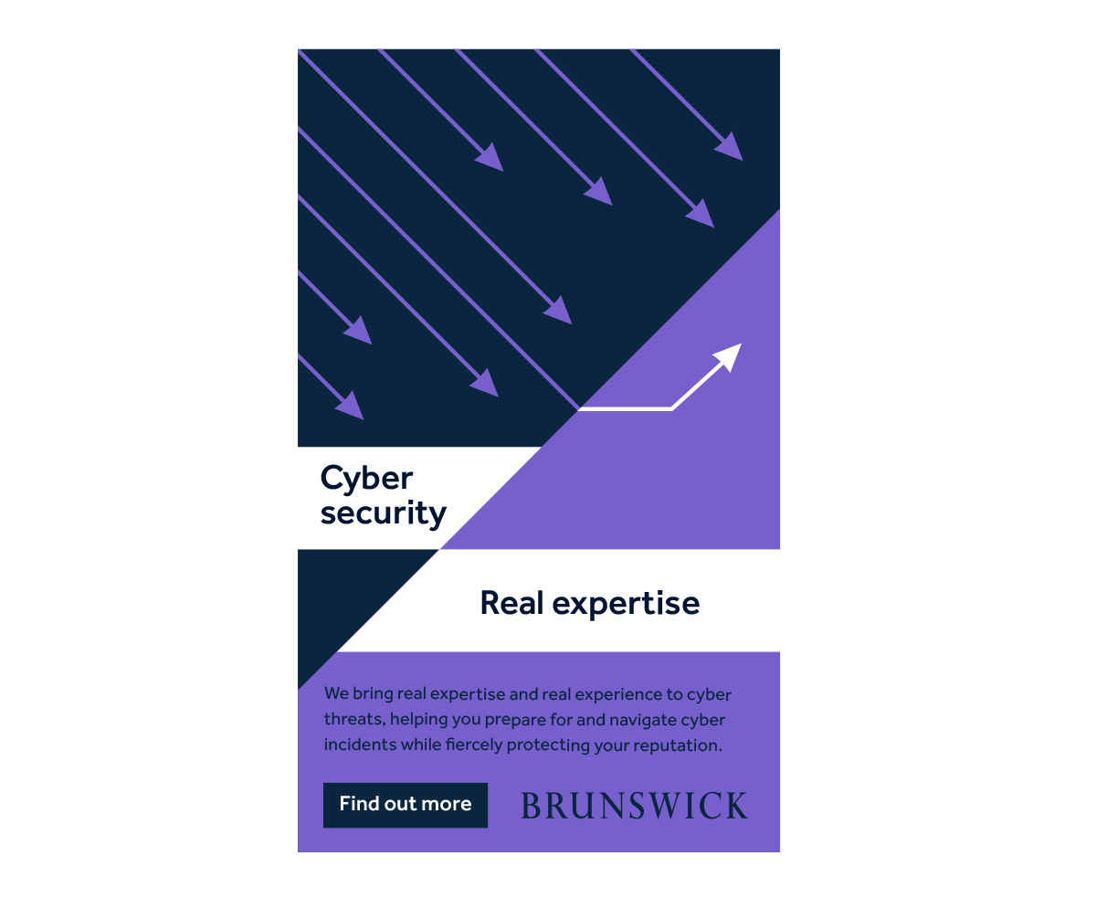
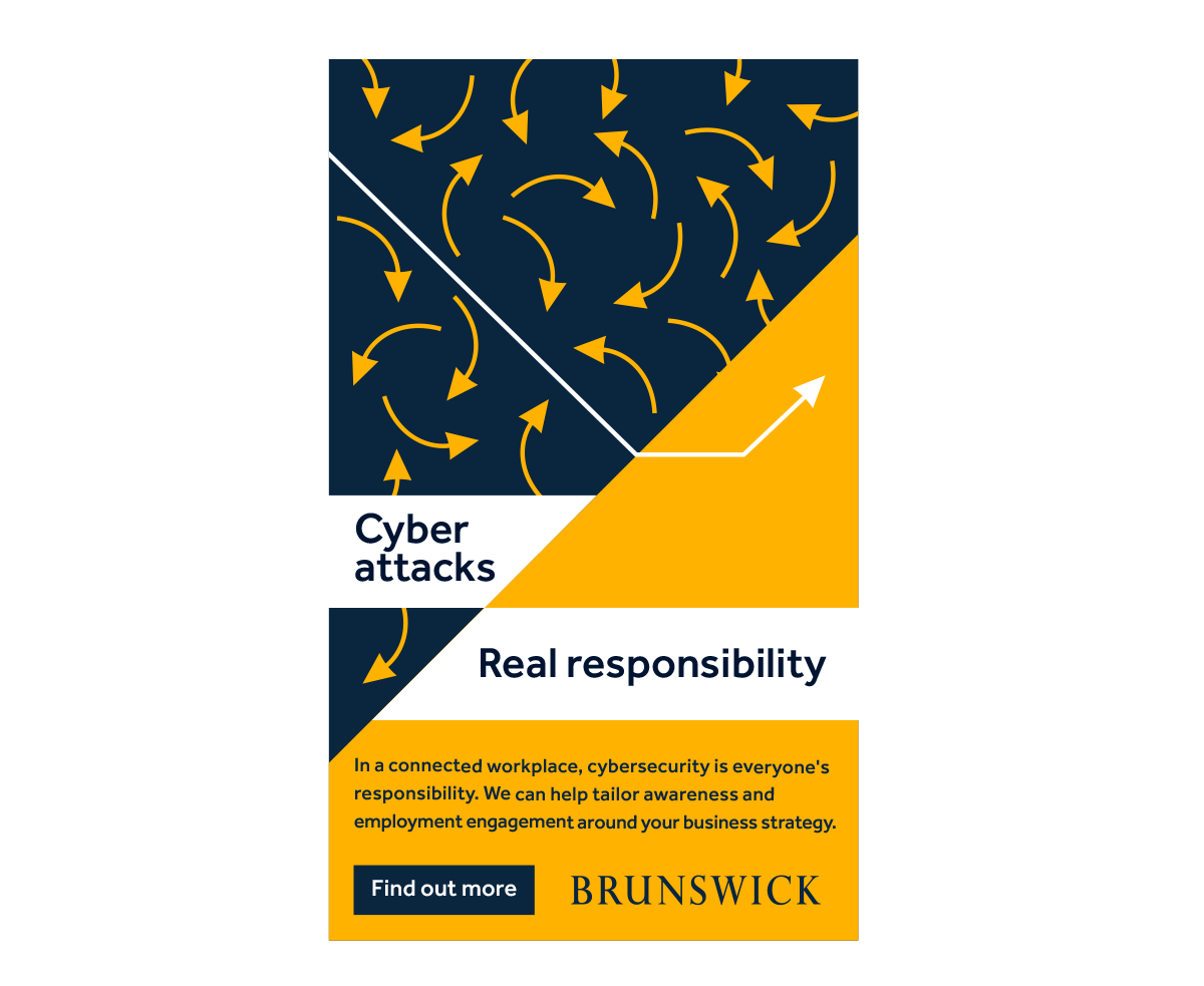
I decided to simplify the representation of the cybersecurity challenges into easily digestible graphic metaphors. For instance, in Real Expertise, a rain of arrows represents these confusing and relentless challenges—and it's Brunswick who makes sense of what’s happening, giving real advice to cyber threats.
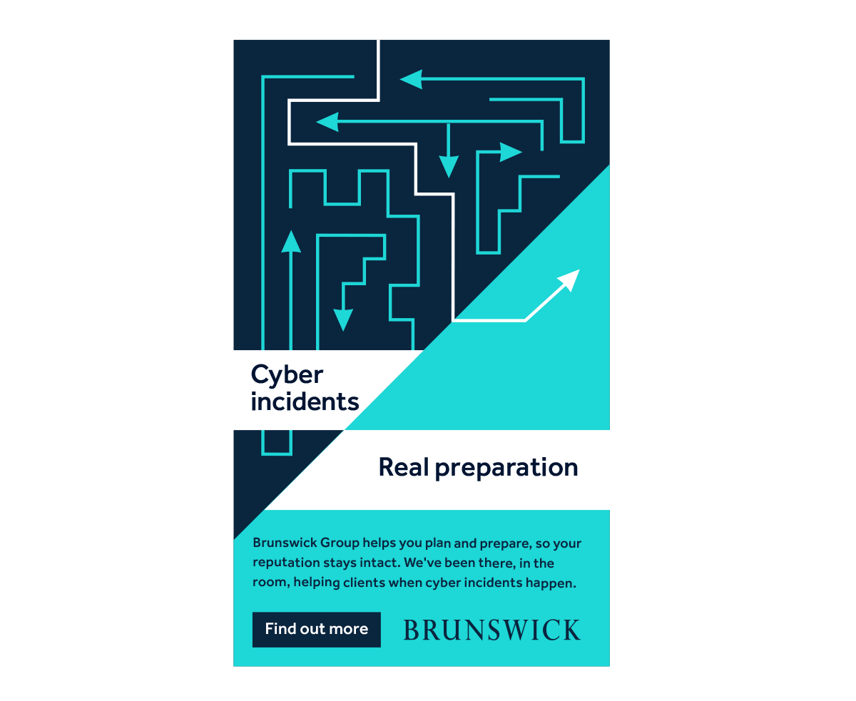
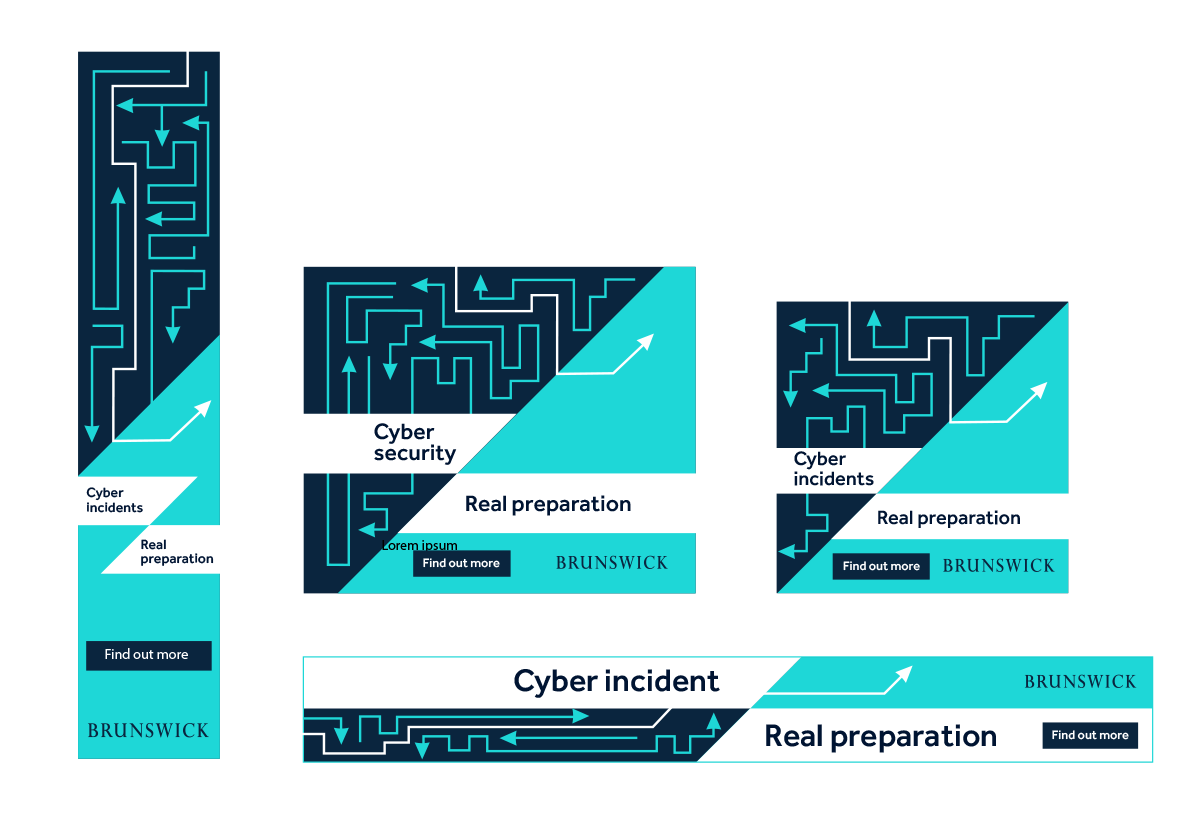
Plan and prepare: The threat of a cyber attack can be a confusing, shifting maze. Brunswick cuts through, helping companies see around corners and bringing clarity to the myriad of options and confusion that is cybersecurity.
Employee advocacy: An uncoordinated employee base, in which every party goes its own way, can be a huge vulnerability. Brunswick cuts through the disorganization, bringing a sure plan that’s ready for a crisis.
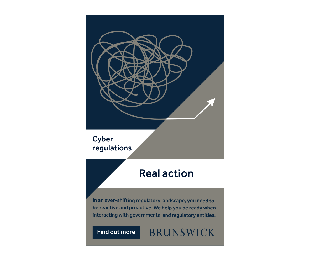
Regulatory and public affairs: Dealing with cyber regulations and governmental parties can be a Gordian Knot of complexity. Brunswick helps companies be proactive and reactive and find a clear path out of the confusion.
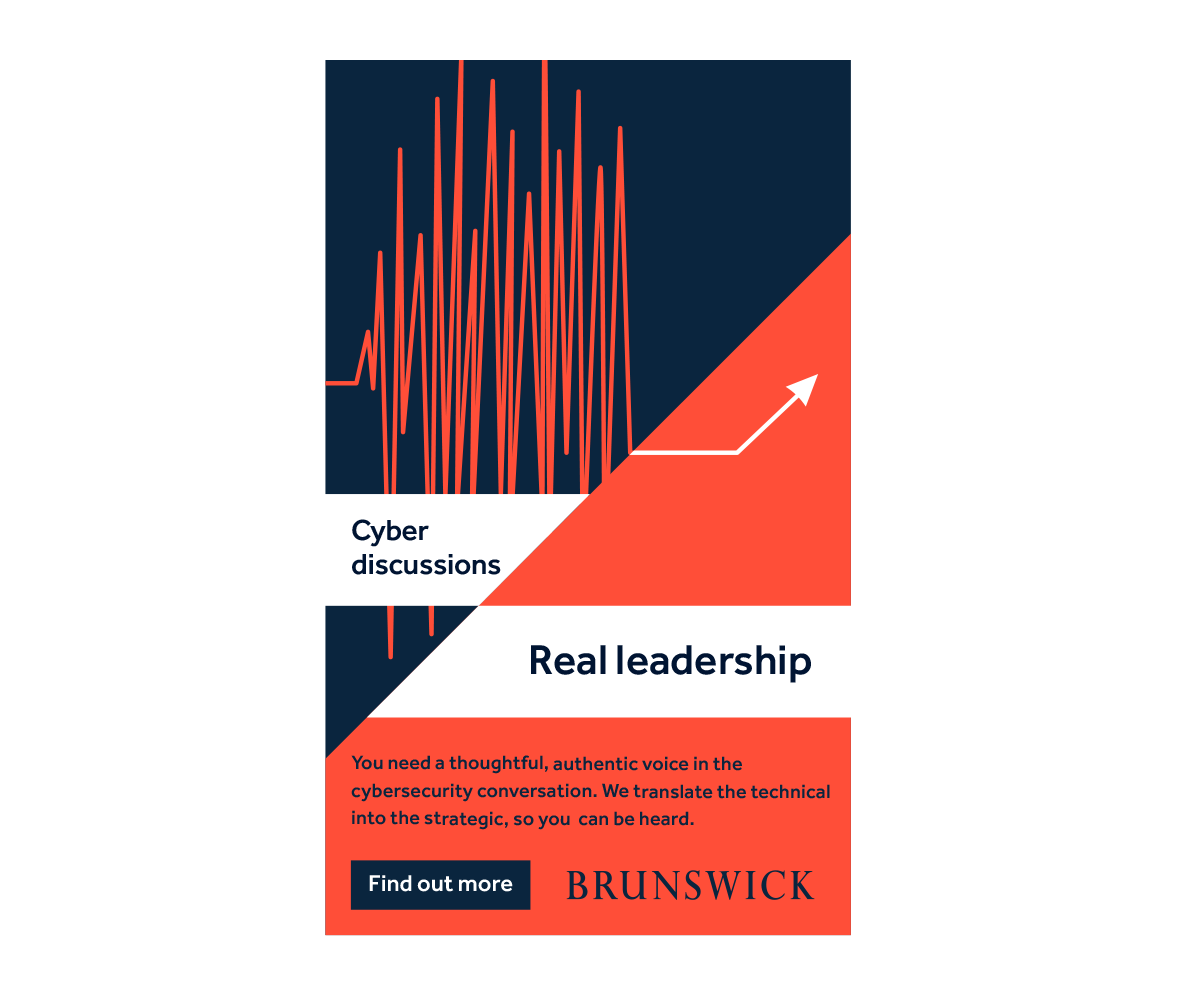
Leadership: Being heard in the cybersecurity discussion means having leadership that can speak with a clear, authentic voice. Brunswick translates the technical into the strategic so our clients can rise above the noise.
The visual treatment proved well-suited for a variety of formats and sizes. Here are just a few of the web banner sizes.
Skills
Art direction
Brand strategy
Identity design
Animation art direction
Website design
Deliverables
Brand and brand book
Website design
Website development
Email templates
More Work

SmarterScoutFind the best players. First.

Measurement within walled gardensA brand that delivers transparency
Seaport KidsCreating a kids universe at the Seaport

Measuring gender and diversity accuratelyMeasuring for change
Let them playHow do you make cyber-awareness fun?
Three men and the seaPassion for craft
How to say ‘Hallo’Letting a brand teach a language

Lighting the wayHelping shine a light
LogosA selection of logos for clients
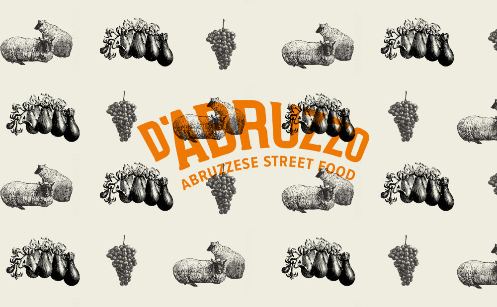
Reviving traditionHow to turn tradition into novelty

The GastronautsHow to design a pop-up club that lasts 14 years
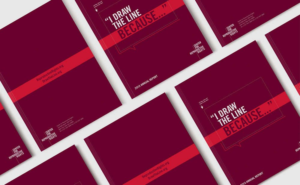
How to draw the lineHow to make a printed annual report interactive

Center for Reproductive Rights annual reportsCenter for Reproductive Rights annual reports

Little EatersCapturing a moment.

EndX turning negatives into positivesHow to overcome a difficult subject matter
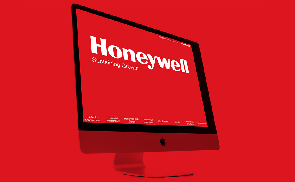
Honeywell insideWhat really matters is on the inside

IllustrationsA sampling of illustrations for clients & personal projects.

The Gastronauts rebootThe Gastronauts get a refresh

REUN!TEA fundraiser for immigrant families separated at the border

2023 Holiday CardAnimated holiday card

The exploding potluck posterHow to blow up a potluck
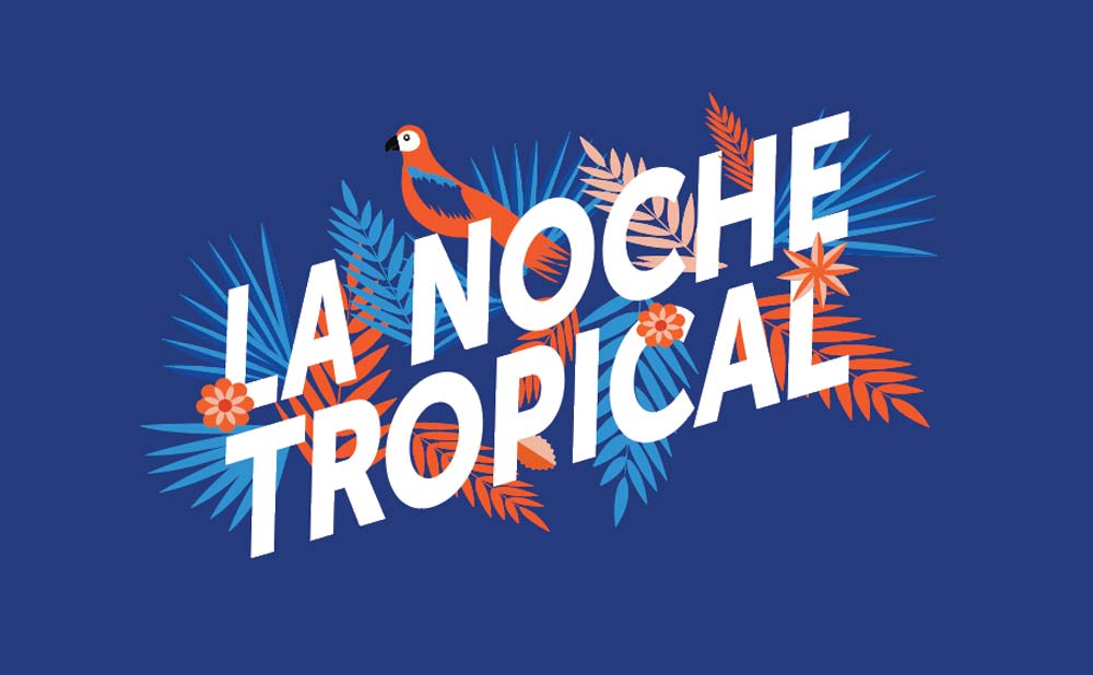
PS 84 PTA gala brandingPro bono branding a PTA Gala

2020 Covid Holiday CardAnimated holiday card
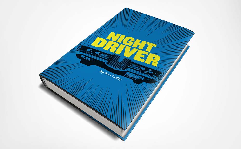
Night driver book coversA series of book cover explorations

Garden party posterHand-drawing the solution
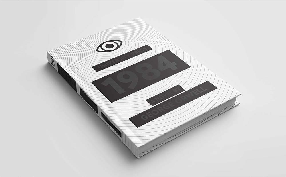
1984-2018A cover for Orwell's classic
